Datepicker
The @ijavad805/react-datepicker package provides a feature-rich datepicker component with built-in support for both English and Persian locales. This guide covers installation, available features, and usage examples to help you get started quickly.
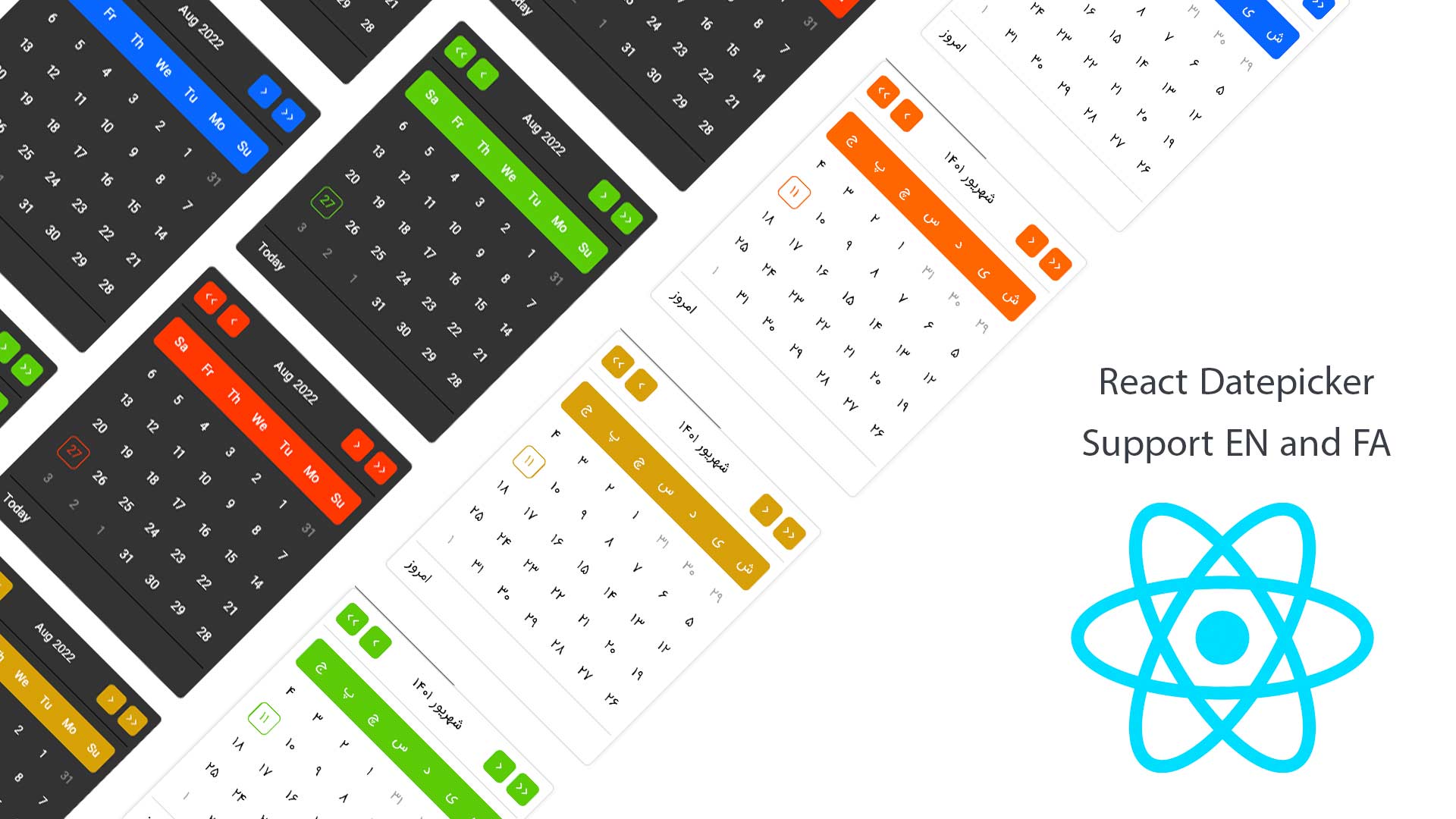
Features
- Choose between five preset color themes.
- Built-in dark and light modes.
- Configurable loading indicator with custom content support.
- Use any custom input component.
- Highlight days with custom events and styles.
- Flexible date formatting options.
- Disable specific dates programmatically.
- Provide a custom footer for the datepicker.
- Automatic or manual positioning modes.
Quick Start
-
Install the package:
npm install @ijavad805/react-datepicker -
Import the component and render it with the default configuration:
import { Datepicker } from '@ijavad805/react-datepicker';

function AppSimple() {
  return <Datepicker />;
}
Advanced Usage
Use the component with the full set of customization options:
import { Datepicker } from '@ijavad805/react-datepicker';
import moment from 'moment';

function App() {
  return (
    <Datepicker
      footer={(moment, setValue) => (
        <div
          onClick={() => {
            if (setValue) setValue(moment());
          }}
        >
          Today
        </div>
      )}
      closeWhenSelectADay
      dayEffects={[
        {
          day: '2022-09-12',
          color: 'red',
          dotColor: 'red',
          title: 'Whatever you want',
        },
      ]}
      disabled={false}
      disabledDate={(day) => day === moment()}
      format="YYYY-MM-DD"
      input={<input placeholder="Select a date" />}
      onOpen={() => {
        console.log('datepicker is open');
      }}
      onClear={() => {
        console.log('datepicker cleared');
      }}
      lang="en"
      loading={false}
      modeTheme="dark"
      closeIcon={<span aria-hidden>×</span>}
      closeIconClasses="my-clear-btn"
      theme="blue"
      defaultValue={moment()}
      adjustPosition="auto"
      onChange={(val) => {
        console.log(val.format());
      }}
    />
  );
}
Additional Props
closeIcon: Custom React node rendered inside the clear control whenallowClearis enabled. Useful for matching your design system iconography.onClear: Callback fired when the input is cleared (either via the clear control or programmatically). Receives no arguments.closeIconClasses: Additional class names applied to the clear control container so you can style the clear button without overriding global styles.
Reporting Issues
If you encounter any problems, feel free to reach out:
- Email: ijavad805@gmail.com
- GitHub Issues: https://github.com/ijavad805/react-datepicker/issues